The sector of financial services can be a tricky sector to understand for the average joe. The products in this sector even more so.
So how do we move from service provision to service comprehension to service usage?
First we must create awareness to get to the result of understanding. Another key aspect is proper information transfer which results in this understanding of the context and content of the service provided and the product delivered. During this process a conversion of information often must take place supporting understanding which can lead to action, as long as there is a degree of relevance. And that is what KroeseWevers, a financial advise company, was looking for. Setting in motion the process from awareness to understanding to action.
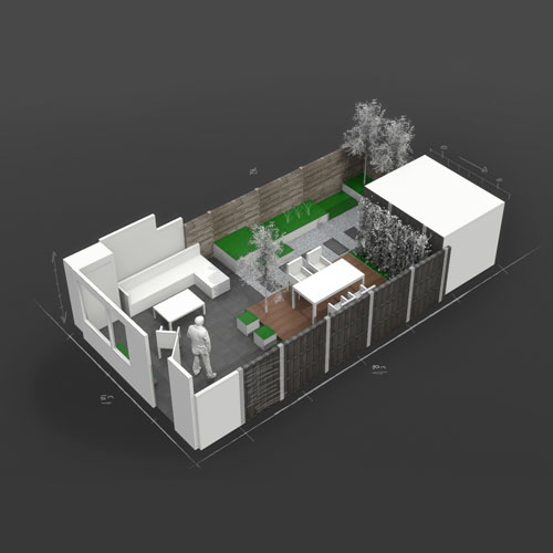
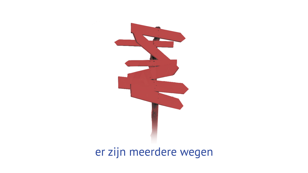
This ‘in motion’ part we take, of course, very literally in the field of motion design. Hence the groundworks for a fitting animation were laid down. From copywriting to storyboarding and style frame creation. Different design angles were experimented with to get to the core of that specific design fitting the needs of the client and the story they wanted to tell. At the moment the project is still in limbo, indefinitely postponed, but an outcome of the style frame experimentation can be viewed here.


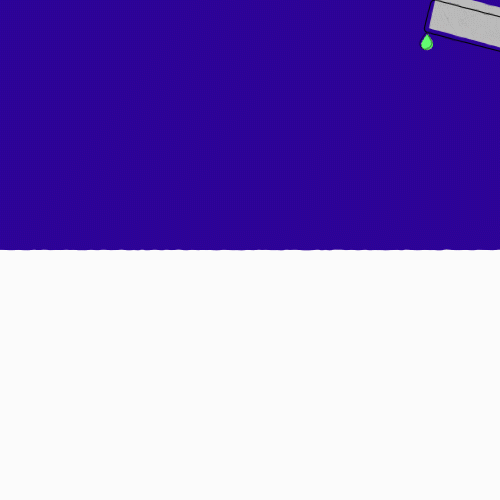
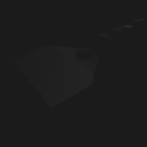
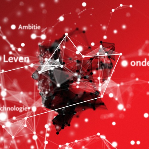
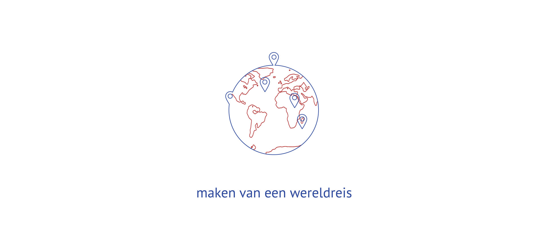
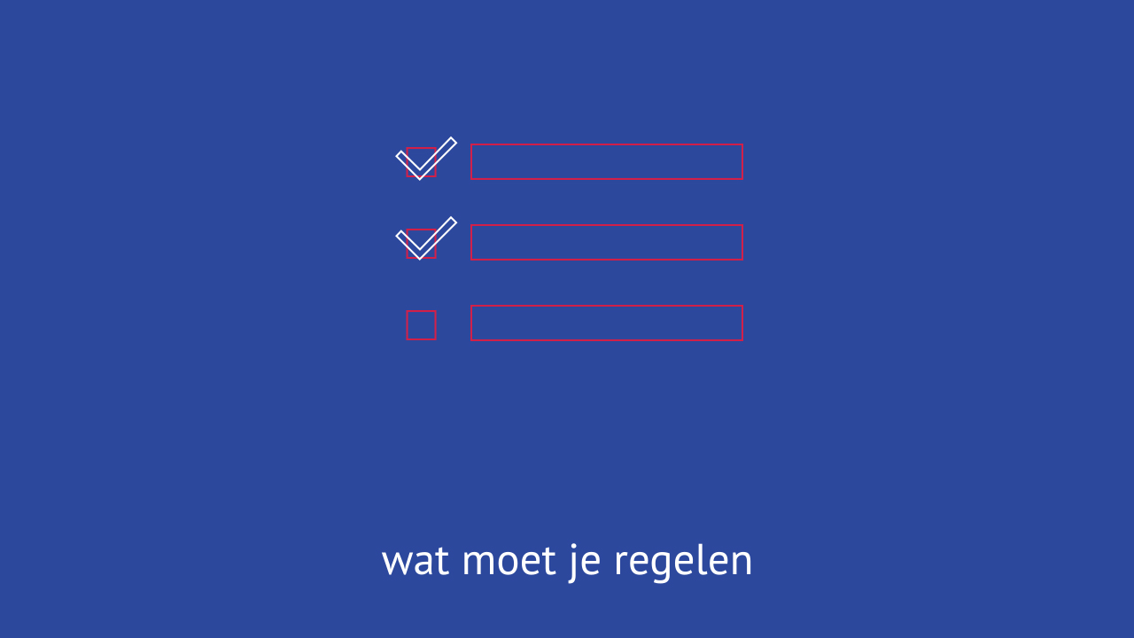
For the creation of the different styles we first took a look at what the client wanted to express and transformed those core values into a basic visual language. Since their products are sometimes complex in itself, the style we had to devise should be reflecting the simplicity they were after. So we’ve taken a uniform coloured background as the canvas and added visual elements at the centre f0r information transfer purposes.
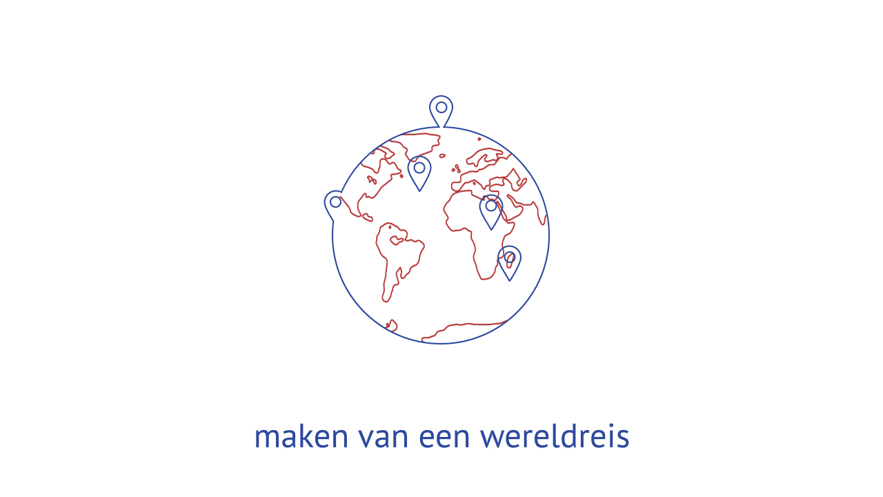

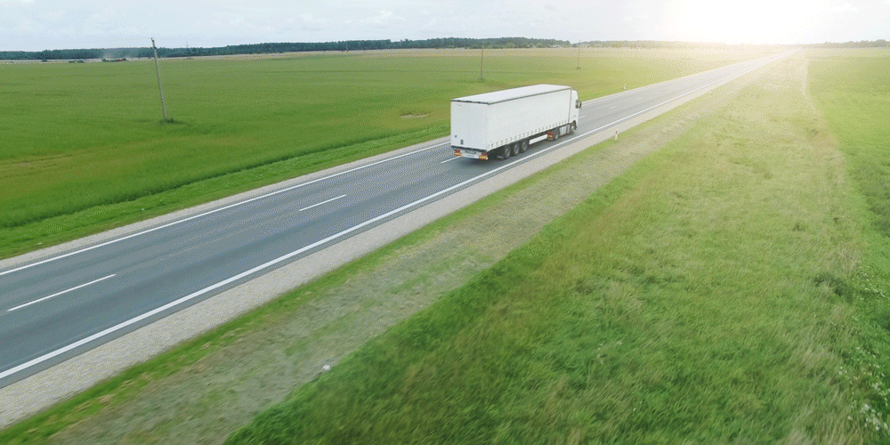
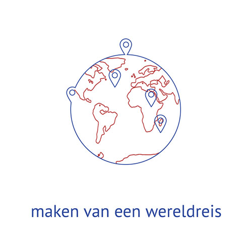
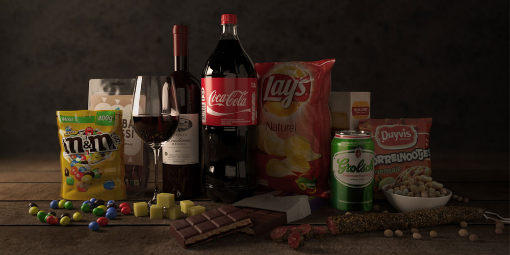
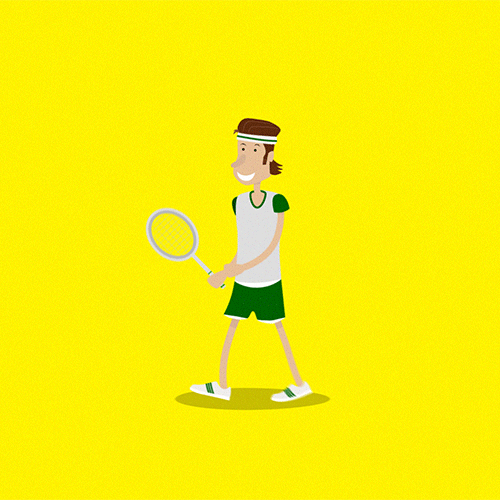
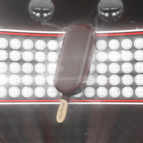
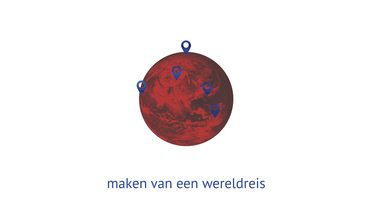
We experimented with line art to emphasise the simplicity in the storytelling. Keeping things formal but also adding a certain playfulness that creates the human connection. Another style was partially based on 3d elements that added some perspective and depth complimenting the narrative. Lastly we also threw photographic components into the mix to ascertain more realism, something the client was already accustomed to.

Client:
KroeseWevers
KroeseWevers
Agency:
Buro Blink
Buro Blink
Producer:
Jelke te Loeke
Jelke te Loeke
Art Direction & Design:
THE REBELLION
THE REBELLION